Mobile buttons may be small, but they often carry the biggest responsibilities in an app. They help people pay, save, book, upload, confirm, and recover from errors. Reviewing strong examples of app button design can help teams see how hierarchy, wording, and placement work together, but the best solution always begins with the user’s task.
A button should make the next step feel obvious and safe. When users cannot tell what an action does, cannot tap it comfortably, or receive no response after tapping, frustration grows quickly. Effective button design reduces that uncertainty at every stage of the journey.
Why Button Design Matters On Mobile
On a small screen, every action competes for limited space and attention. A well-designed button guides users forward without requiring them to pause and interpret the interface. A vague “Continue” button can create hesitation, while “Continue To Payment” sets expectations before the tap. Clear actions reduce missed taps, repeated taps, and abandoned tasks.
Start With The User’s Goal
Do not start with a color palette or a favorite button shape. Start by identifying the one outcome the user is trying to achieve on that screen. In a checkout flow, paying may be the primary goal. In an account form, saving changes may matter most. Supporting actions should remain available, but they should not distract from progress.
- Identify the main task on the screen.
- Choose the action that moves the user closest to completing it.
- Remove choices that add noise without helping the task.
- Keep supporting actions visible but less prominent.
Create A Clear Action Hierarchy
Users should not have to compare several equally bright, equally large buttons to decide what to do. Visual hierarchy communicates importance before anyone reads the label.
Use Three Levels Of Emphasis
- Primary actions:Reserve the strongest styling for the main task, such as “Pay Now,” “Save Changes,” or “Confirm Booking.”
- Secondary actions:Use quieter styling for useful alternatives, such as “Edit Address” or “View Details.”
- Tertiary actions:Use text links or low-emphasis controls for less common options, such as “Remove Item” or “Contact Support.”
Place related actions near each other, use enough spacing to prevent accidental choices, and keep the primary action in a consistent position across similar screens.
Make Buttons Easy To Tap
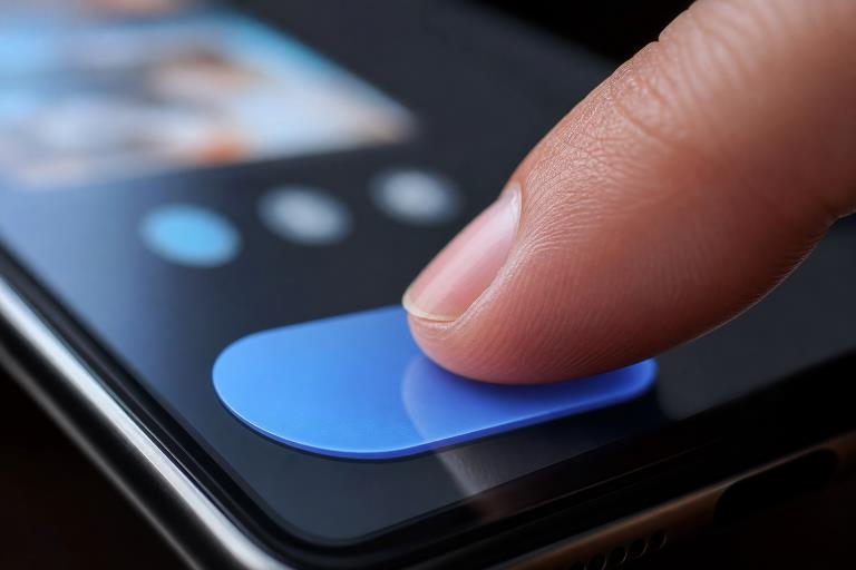
A button that looks polished but demands precise finger placement is not usable. Give the entire control a generous tap area, leave clear separation between nearby actions, and consider how a person reaches the screen with one hand. Test both portrait and landscape layouts, especially when buttons sit near device edges or system controls.
Risky actions deserve extra protection. Placing “Delete” beside “Save” can turn a routine task into a costly error, even if both buttons look attractive. Separate destructive actions, use distinct wording, and consider a confirmation step when the outcome cannot be easily reversed.
Write Better Button Labels
Button text should describe the result of tapping, not merely the mechanics of moving forward. Prefer “Save Changes” over “Submit,” “Start Free Trial” over “Continue,” and “Cancel Upload” over “Cancel.” Short labels are useful, but removing meaningful context makes people guess.
Use consistent verbs across the app. If one screen says “Save,” another similar screen should not say “Done” unless the outcomes truly differ. Icon-only controls can work for widely understood actions, such as search or close, but a visible label is safer when the icon is unfamiliar, important, or irreversible.
Design For Accessibility
Accessible buttons need more than sufficient contrast. They need readable labels, predictable behavior, meaningful names for assistive technology, and layouts that still work when text is enlarged. Research on visual design and accessibility settings also reinforces how unclear icons and altered layouts can create barriers for older adults.
- Use semantic button controls whenever possible.
- Give icon-only controls an accessible name.
- Do not rely on color alone to communicate status.
- Allow larger text without clipping labels or hiding actions.
- Keep focus indicators visible for keyboard, switch, and voice users.
- Respect reduced-motion preferences.
Show Useful Interaction Feedback
Every tap needs a response. A brief pressed state confirms contact, while a loading state explains that the request is still in progress. For example, if a payment button appears unchanged after tapping, users may tap repeatedly and worry that they have been charged multiple times. Disable duplicate submissions during the request, then show a clear success message, screen update, or helpful error.
Plan Every Button State
Button states should be designed before development, not added as an afterthought. At minimum, account for default, pressed, focused, disabled, loading, success, and error states. Disabled buttons need context. If “Continue” is unavailable because an address is incomplete, explain what is missing near the control instead of leaving users to guess.
Avoid Common Mobile Button Mistakes
- Using vague labels such as “Okay,” “Next,” or “Submit.”
- Making the visible button larger than its actual tap target.
- Giving every action the same visual weight.
- Hiding the main action beneath unnecessary content.
- Relying on hover effects that do not exist on touchscreens.
- Removing focus indicators without a clear replacement.
- Changing action order between similar screens.
- Using animation that delays the next step.
Test Buttons In Real-World Conditions
A button can look perfect in a design file and still fail during actual use. Test on small and large phones, in bright sunlight and low light, with larger text enabled, on slow connections, and while using one hand. Watch people complete a task without giving them hints. Practitioner views on mobile app accessibility also show why testing across platforms, assistive tools, and real user needs matters.
Use A Simple Button Review Checklist
- Is the action understandable at a glance?
- Does the label explain what happens next?
- Is the tap target comfortable and separated from risky controls?
- Does the button work with screen readers, voice controls, and larger text?
- Are pressed, focused, disabled, loading, success, and error states clear?
- Does the user receive useful feedback after tapping?
- Is the design consistent throughout the app?
Conclusion
Strong mobile button design is not about decoration. It is about helping people act with confidence. Clear labels, comfortable tap areas, accessible behavior, visible states, and timely feedback can make a simple control feel dependable. Treat every button as part of the full user journey, then test it with real people, devices, and conditions.